 | ||||||||||||
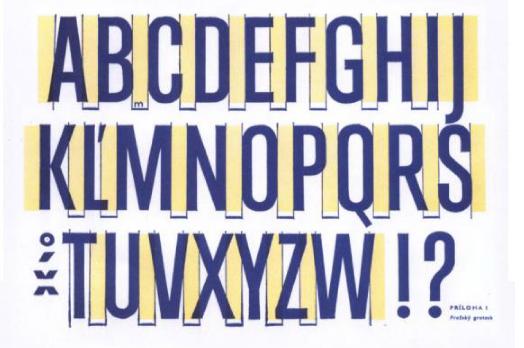 | ||||
Moods for Moderns Copyright 2003, By Jandos Rothstein ABZ: More Alphabets and Other Signs Originally Published in Washington City Paper, July 18, 2003. We live in an era when everyone, wittingly or not, is a typographer. Corporations and government agencies, which once neither noticed nor cared which type ball was plugged into their IBM Correcting Selectric IIs, now issue stern internal memos insisting that all correspondence be set in the ubiquitous and bland Helvetica face in preference to the equally ubiquitous and bland Times New Roman. Grocery-store bulletin boards, once a sea of hand lettering, now display a range of slick desktop-published adverts. These range from the ordinary to the whimsical to the incomprehensible, all thanks to a nearly endless supply of font choices pre-installed on every computer, and more to be downloaded for free from the Internet every day. Most of us are cavalier about our accidental membership in a guild that once required a seven-year apprenticeship to be a fully recognized member. If we have any cultural aspirations at all, we generally own at least a book or two about fine art—even if we have not touched a paintbrush ourselves since grade school—but very few make such study of the culture or artifacts of type design. Perhaps because text assaults us from all sides, type seems (and in many cases is) a minor graphic addendum to the written word. Another reason books about typography rarely find a spot on the shelves of the cultural elite is that most deserve to be shunned outside the design field—even, or perhaps especially, the ones created for a theoretically broader audience. Typographical literature often drips with attitude. Even before the days of widespread desktop publishing, master typographers regarded themselves as a kind of a priesthood, preserving a holy craft against the crass commercial desires of infidel clients. Back then, type was created on delicate and expensive equipment that required an arcane set of skills to operate. Now that it can be created effectively on any notebook computer, a set of esoteric skills that go underappreciated by most readers—oh, and an underfed and overweening ego—is all that the modern master has to distinguish himself from the hordes and affirm his membership in a forgotten order. Thus books for beginners with such preachy titles as Stop Stealing Sheep and Find Out How Type Works (a reference to a quote by type designer Frederick Goudy, who observed that anyone who would “letterspace” lowercase letters would “steal sheep”) seem more intent on banging neophytes on the head with rules than on teaching them why the rules might matter in the first place. And books for professionals are often, in effect, extended promotional brochures for successful designers or firms—interesting to those who want to learn the secrets of whoever swept the contests last year, but lacking in perspective or context. But perhaps change is in the air. In 2001’s Jimmy Neutron: Boy Genius, the computer-generated protagonist determines that a note purportedly from his parents must be a forgery because the letters are not “kerned” in his parents’ way—a once-obscure typographical term used as the basis of a joke in a children’s movie. Design books seem to be improving, too. And if any book on typography deserves to break through to a broader audience and be appreciated as one might a museum catalog, it is ABZ: More Alphabets and Other Signs, edited by Julian Rothenstein and Mel Gooding. A collection of type and page designs that reflect the “optimistic modernist spirit of the early and mid-twentieth century,” according to an introduction by Gooding, ABZ focuses on pre-World War II graphic design in Europe—and feels much like a product of that time and place. The book is proportioned taller and thinner than is currently in vogue, with the stylish rounded corners of socialist literature. The sense of artifact is heightened by the cover’s sun-faded palette and the pages’ yellow-stained edges. Still, readers of ABZ will be surprised to see how current much of its content looks. The sans-serif fonts in particular, reproduced from type-catalog pages, seem particularly fresh. For four decades, sans serifs tended to fit into one of two categories—geometric fonts, such as Helvetica, that for the most part look as if they could have been drawn with a compass and straight-edge, and “humanistic” fonts, such as Johnson’s Railway type (still used today for signage in the London Underground), which follow the more elegant proportions of Roman monumental letters and simply omit the tips used to finish off letter strokes. By contrast, contemporary taste runs to sans fonts that are more idiosyncratic. Joost Schmidt’s condensed grotesque typeface, reproduced here as a partial alphabet with some characters laid out on grids, would look right at home in Wallpaper* magazine. Highly geometric, it has subtle art-deco flourishes—an enormous counter in the capital A, an organically minimal W—that make it a much livelier design than the sterile Swiss fonts in particular that we all grew very, very sick of in the ’60s, ’70s, ’80s, and ’90s. ABZ is most concerned with the modernist typographical experiments that came out of the Bauhaus or constructivist school, were created by Jan Tschichold, or were influenced by his 1928 manifesto The New Typography, a document as fiery a polemic as Filippo Marinetti’s far more famous futurist proclamation. (One is inclined to have more sympathy for the youthful passion of Tschichold—who went on to be head designer for Penguin Books—than of Marinetti, who went on to ally himself with Mussolini.) But the book certainly does not discriminate against other “optimistic” schools of design, including those that the modernists were reacting to.Some of this optimism was technological rather than philosophical in origin. When words were printed from a raised metal surface—the technology inherited from Gutenberg—ink was transferred to paper by pressing the type into the surface under great pressure. The process required type that was fairly hardy—a design couldn’t be too thin or delicate, or it would rapidly become damaged. The type also had to be designed with the three-dimensional printing surface in mind. Sharp corners, such as the apex of a capital A, could collect surplus ink, distorting the shape of the printed letters. In the first half of the last century, various forms of lithography—printing from a flat plate—became increasingly prominent. The new technology, which allowed type to have virtually any shape, to appear three-dimensional, to print in multiple colors, to be set in curves, to have endless details and flourishes, led to typographical excesses (or frenetic graphic joy, depending on your outlook). ABZ includes several examples of this school of work, which was typically employed in the service of commerce. Cigarette packs demonstrate an almost wacky Victorian style—bright, clashing colors combined with distorted letter forms and hypnotic patterns. On one page, a French menu takes the form of a rooster drawn with lines of curved type, image and text integrated as could never be done before. But typographical pictures were most appreciated by the socialistically inclined of the modernists—a Weimar Republic-era book cover of an Upton Sinclair translation shows three classic capitalists, each in a suit, one wearing a top hat, climbing or hugging a giant dollar sign. ABZ does not neglect the sign painter’s art—once a more important commercial art form than it is now—even if it reproduces no actual signs. Lithographed pages from early 1900s sign painters’ manuals show images of letter forms with drop shadows, outlines, and highlights, all of which would have been practically impossible with letterpress technology. These images raise the question of how much sign painting was influenced by the new freedom in printing—if not the impetus, lithography was surely necessary for the dissemination of these ostentatious styles. Of course, sign painting continues to be influenced by technological innovations in other media. Hand-painted signs often contain both echoes and imitations of desktop publishing—the outlines and drop shadows that can be accomplished with the push of a button on the computer, the odd computer-style quote mark. ABZ has virtually no explanatory copy—which is not a drawback for the mildly interested amateur, who can enjoy the book without distraction, or the professional designer, who can revel in the many fine examples without the wasted space of text that would only duplicate that of many other books on her shelf. Those interested in context, however, would do well to supplement ABZ with other volumes. Steven Heller and Louise Fili’s Typology: Type Design From the Victorian Era to the Digital Age, a far less beautifully packaged but more thorough book, with highly readable short subject essays (really the length of long captions), would be a good place to start. If ABZ does not promise to be anything other than an idiosyncratic collection of 20th-century typography, it keeps its promise. And if it inspires a little bit of Bauhaus revival on our nation’s grocery-store bulletin boards, well, there’s nothing wrong with that. | ||
Jandos Rothstein, Editorial Design, Publication Branding and Design Journalism | ||